This is an isoline map of the U.S. displaying the average temperature from March 18 to 24, 2001. The scale of temperature indicated by colors ranges from 100 to -30 degrees Fahrenheit. The lines indicate the general boundaries of the temperatures. As you can see on this map, the temperatures at this time ranged from the 80's to the 30's.
Tuesday, January 31, 2012
Isoline map
This is an isoline map of the U.S. displaying the average temperature from March 18 to 24, 2001. The scale of temperature indicated by colors ranges from 100 to -30 degrees Fahrenheit. The lines indicate the general boundaries of the temperatures. As you can see on this map, the temperatures at this time ranged from the 80's to the 30's.
Proportional Circle Map
https://blogger.googleusercontent.com/img/b/R29vZ2xl/AVvXsEga0ydm4Fg9E18EfVLLzpZWFf7QHnV2Sn02oMPif8jI7BpoqlJzkbvaK-F21I6Y1jnJ0Pr7pNWk4Y16sGkYSAk6OEG_lSWGlhBDTjG1S3f7DN9RvDJIOUUUQtI3Y1r630-2-GvdZJmoK600/s1600/Range%252BGraded%252BProportional%252BCircle%252BMap.gif
This is a proportional map showing the Hispanic population in the U.S. by using circles in each state indicating the population in 10,000, 100,000, and 10,000,000. According to the map, it seems Texas and California have the largest Hispanic populations.
Choropleth maps
https://blogger.googleusercontent.com/img/b/R29vZ2xl/AVvXsEivK6GcQ69pSWKmZN63Mx3VLfDSEtmMkKjjnhDPC-CcHUH384TGLLPpXw9wSXo_Nv1EnRBjzaCvXiiphBjY8EvdHVaJ-sBGGS_eWSxKqaUFijhVhd6UhwZ3RidEk0UkCjhNHyPVBg9xEOUj/s1600/changeanim.gif
This is a choropleth map showing the change in divorce rates between 1980 and 1990. It does this by having a scale of different colors showing the percent increase of divorce rate in each state.
Dot Distribution Map
http://www.census.gov/geo/www/mapGallery/images/small2kden.jpg
This is a dot distribution map of the United States. The white dots represent the population distribution in the year 2000. According to the map, it seems that the majority of people reside on the east and west coasts.
Propaganda map
This is a propaganda map of Florida. It is clearly used to persuade people to come vacation at Florida by displaying an attractive female relaxed on the sand. It emphasizes the coast of Florida by showing much of the Gulf of Mexico and arranging pictures of palm trees and tourist attractions on the state.
Hypsometric map
http://www.reliefshading.com/colors/pictures/hypso_france.jpg
This is a Hypsometric map of France. It shows elevations of the land by contouring and shading.
PLSS maps
http://upload.wikimedia.org/wikipedia/commons/8/83/Meridians-baselines.png
This is a PLSS map of the United States. This map shows the principal meridians and baselines in order to survey the states.
Monday, January 23, 2012
Thematic map
http://www.gigawiz.com/images9/thematic1.jpg
This is a thematic map of the United States. It displays the states' party control of governor's offices as of 2007 in each state by showing them either in blue or red to show that it's democratic or republican respectively.
Wednesday, January 11, 2012
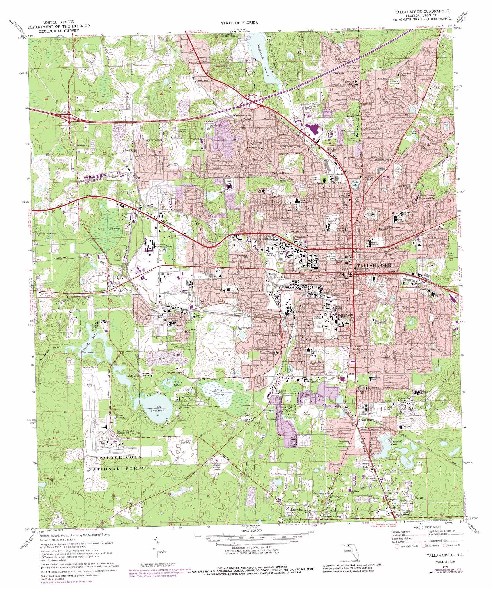
Topographic Map
http://www.yellowmaps.com/usgs/topomaps/drg24/30p/O30084D3.jpg
This is a topographic map of Tallahassee which uses contour lines to represent the shape an elevation of the land.
Planimetric Map
https://blogger.googleusercontent.com/img/b/R29vZ2xl/AVvXsEgpx1OS_xSaR7pk-atvnBgeA8HU8EL8gWe73j1MwZZ0eEuYWe9eu4UDXeWz-kEZFQ6zlyNssEg78hlrHeUWDD0YVj2DdZX-CpdHGmW0All_t54ukCLlcEaIgiPtYBvrlUfC-mbuufoBptX2/s400/road_map_of_tallahassee_fl_usa.gif
This is a planimetric map of Tallahassee. It is a surface map showing streets, highways, and lakes. It shows no relief features.
Subscribe to:
Posts (Atom)