https://blogger.googleusercontent.com/img/b/R29vZ2xl/AVvXsEhleNWA8guoD-ne-iqQU6kBBM6tu47rwnGWW-5LdETOHg-RUmvnqanzbipp6gxZiPoAjgKvARseRFuAQkd1hODb_tEKHYPU1Tmz4vLb46yqt7A-PESIVFzmLlGN38LMBmQz1YSWKvOi2c4/s1600/standardized+c+map.PNG
Standardized chloropleth maps calculates the population per square mile so that the distribution of people can be compared. The shading shows the relative population distribution in each state.
Sunday, March 25, 2012
Univariate choropleth maps
A univariate chloropleth map shows a single data set. This map shows water use in the U.S. by shading the states with different colors. The darker the color, the more water use, so Texas, Florida, and California are shown to use the most water.
Bivariate choropleth maps
http://www.mpassociates.gr/software/distrib/science/golden/PrismMap.gif
This bivariate choropleth map shows the distance from the Mississippi River as well as number of confirmed human cases of the West Nile Virus. Distance is shown by color and number of cases is shown by the height of each state.
Unclassed choropleth maps
http://www.agocg.ac.uk/reports/visual/casestud/dykes/figure9.gif
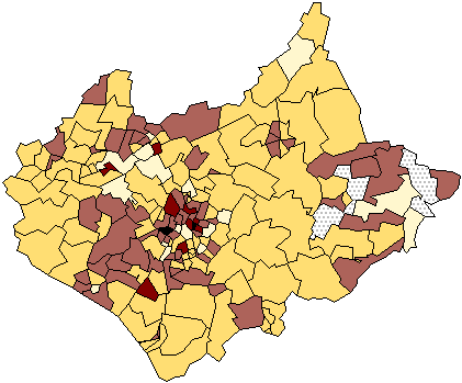
The shadings are proportional to the data values in unclassed chloropleth maps. Because of this, the data does not need to be classified.
Classed choropleth maps
https://blogger.googleusercontent.com/img/b/R29vZ2xl/AVvXsEj7r8h3t7sxbyVM4xmTwiId1z1Tcup2uRSKGej3qtaAeG4QvwgE04olvailtOMRlayYVp20aPQ_xhY6NcVIoJIYigo1QhftyCSahq6hPlijQMYlQ0LRjXAjgHD55AN6LTzO0E2HPbM7z3Q/s1600/beefmethaneJMK.gif
This classes chloropleth map uses coloring and shading to depict the beef cattle emissions in North Carolina. The darker the area, the more emissions being produced.
Range graded proportional circle map
http://www.neiu.edu/~jrthomas/377/circle.jpg
This range graded proportional circle map shows the proportion of Mexican people in each state. The circles are in different sizes proportional to the given value of the data. Texas and California have the biggest circles, therefore there are more Mexicans living there than any other states.
Continuously variable proportional circle map
https://blogger.googleusercontent.com/img/b/R29vZ2xl/AVvXsEjHFzLQP6r39_lF7gWQfAVuk6lyPXSxA7UOYBu8OlYeRokFlfT9C-eyEo1h53hjTxq03IMOYWA_vO9ogHYH33Ofpsnvg23RKt3AGfGtpauzXT96V3Wg_vN8yrnYDii6AZebp5UIRnBA39c/s1600/continuosly+variable+proportional+circle+map.jpg
Continuously variable proportional circle maps depict the proportion of a variable in a certain area. The one above shows the proportion of Hispanics in California's cities in relation to each other.
Subscribe to:
Posts (Atom)