Sunday, April 1, 2012

Population profile

http://2.bp.blogspot.com/_46URaoUSp0A/S83Yp5Ojf7I/AAAAAAAAAD8/hzPSigx8cKc/s1600/image.jpeg.gif

Population profile maps are designed to show demographic grouping. This map shows ages of males and females in the United States.


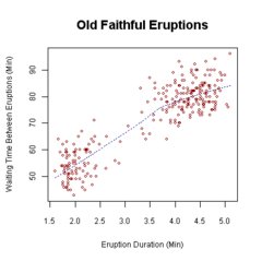
Scatterplot

http://upload.wikimedia.org/wikipedia/commons/thumb/0/0f/Oldfaithful3.png/240px-Oldfaithful3.png

Scatterplots display values for a set of two variables for a set of data. This is a scatterplot of two Old Faithful eruptions. It shows how many minutes are in between the two eruptions and the eruption duration.

Index value plot

https://blogger.googleusercontent.com/img/b/R29vZ2xl/AVvXsEjjUrPXvSFNR0U2JpDNXz28SwVfvY-I8bY6pabce-coJd0HgMMQ93k0SPaikLHyksHU9aoLW8WgzEsVSC4TFss1uQw8rrwGMqW-vIcTOGUMSIgnZG78iwhOd7orUqh7WweYjzLBZlp2FXU_/s320/Index+Value+Plot.gif

Index value plots are designed to indicate absolute numbers and values. This map shows the expected percentage of average streamflow index in North Carolina from 1999 to 2008.

Sunday, March 25, 2012

Accumulative line graph or Lorenz curve

https://blogger.googleusercontent.com/img/b/R29vZ2xl/AVvXsEi4JV7DGwVyeHADGQ9nnUzZ37_Sp1X99dDqDkQ_3AMxRJ1caUbFSaEU7kvvLoaBma_P88ndETMOUHVkFWwVidbiBV2UFjC0iNl-GjwL9JQRJDwCpjd5f9WWxHA-MNejqLq7DbW898aG7FO1/s1600/Lorenz_curve.jpg

This type of graph is a geovisualization of household income and expenditure. The center line is the line of equality.

Bilateral graph

https://blogger.googleusercontent.com/img/b/R29vZ2xl/AVvXsEia3xUBrPmi0u5op0JdWh_MI6cnwwwHbX-7GgqA7tIHYdZpjmtgQHcYwRpX-H3jRWUZR4KBU-amAJwH2M0CKry3xuxEM1p6t9cxt3s6gkEVhtDjEmVQqjkNYcrdLASAs3o3VIWeuPCQ-xPt/s1600/bilateral-graph-02-lg.gif

This bilateral graph shows the percent correct for three month intervals. The increases and decreases are shown for each amount for 3 months.

Unstandardized choropleth maps

http://eps.mq.edu.au/courses/GEOS219/images/deaths.jpg

Different color shades are used in unstandardized chloropleth maps to represent data. These types of maps are not aerially averaged, nor do they use numerical data or ratios. This map shows deaths per 1,000 live births in Australia.

Nominal area choropleth map

https://blogger.googleusercontent.com/img/b/R29vZ2xl/AVvXsEiXdtpUXqJ43TRH41yZJJ7dNFGf7w8Ml3J-km9tAp42fRorn8nrs1Zgo0ZE7qrxDNZYXwqLZtEAtTZB9HnQrZVTPr739-JYFdimY0LDEtVp8e063S6dytMmc0PIz7uK6Byr0R72sYwlQKY/s1600/Figure+8_3b.jpg

This map shows quantitative differences in the access to safe drinking water. Nominal area chloropleth maps use nominal data to represent information.