http://mainland.cctt.org/mathsummer/josephbond/stemandplots/images/table2.gif
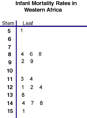
Stem and leaf plots are great for presenting qualitative data in a way that is easy to visualize and understand, a lot like a histogram. This stem and leaf shows infant mortality rates per 1,000 live births in Western Africa.
Tuesday, April 3, 2012
Box plot
http://www.stat.yale.edu/Courses/1997-98/101/boxplot.gif
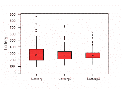
Boxplots are made to summarize data that is measured in intervals. This box plot shows winning numbers in a lottery three different times. The median for each set is shown by the black line in the red boxes. In this plot, the medians are all nearly the same.
Histogram
http://upload.wikimedia.org/wikipedia/commons/thumb/c/c3/Histogram_of_arrivals_per_minute.svg/250px-Histogram_of_arrivals_per_minute.svg.png
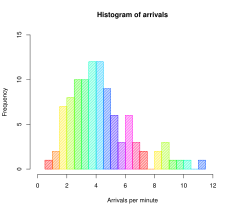
Histograms are designed to show distribution of data in a way that makes it easy for people to compare visually. This histogram shows the frequency and arrivals per minute. For example at 6 arrivals per minute there was a frequency of about a 6 or 7.
Monday, April 2, 2012
Parallel coordinate graph
https://blogger.googleusercontent.com/img/b/R29vZ2xl/AVvXsEi5Jcky1KH6BLDBzzmSop8Ox3D-YgAyROj8hLca9hMMMR0JAtrzZuOOKKupeJnZRG_HRovoinNtJwnyxDHHi2Vtc5tlaW2V8I3TthqFG8cQIlfpxGlIeZ80SkJsICzfrhPkiSq0gXBlg2I/s1600/parrel.png
This map shows the spatial relationship between different genes. Parallel coordinate graphs are intended to analyze multivariate data.
Sunday, April 1, 2012
Triangular plot
https://blogger.googleusercontent.com/img/b/R29vZ2xl/AVvXsEjeDc5yvRVXSl3XLUgxRXqRKqNZKMneG9AhfPOKQsL6qWGGufKkmBrOxcztmBw7QDwTx_ChfdhBlOca4QjRpeW5D5V8W2LztRE8bUpDzoYeFmVwQzzemdg2IsPjT-QynyajR8EC3kNj41i4/s400/triangular+plot.png
A triangular plot displays three variables presented in a triangle so it is easy to compare the data. This plot shows the percentage of conservative, liberal, and labour votes.
Windrose
Windroses are on maps to show how wind speed and direction are distributed at a particular location. This windrose shows that there is a higher wind speed towards the west.
Climograph
https://blogger.googleusercontent.com/img/b/R29vZ2xl/AVvXsEjOoIPJHn2dVXKhTnySrjMIXtqNqyyyHmk-2E5wkrZMXkW-WBss4o3GfqBV4RTTWIm1m77eaErIRLf3iueAdIeXKPWvmqq1DZuCaO5cBkrifhEKPASIyKaeHhfE4r34lBkAPnxh4wbYf1U/s1600/44.gif
Climographs graphically depict monthly precipitation and temperature. This is a graph charts the monthly precipitation and temperature for Moscow, Russia.
Subscribe to:
Posts (Atom)