Sunday, February 26, 2012

DRG

http://128.206.12.101/data/drg/images/drg-index-map.jpg

This is a DRG map of Missouri.

Isopleth


This isopleth map shows hydrogen ion concentration made at field laboratories. On the west, the ph is high and on the eastern side, the ph is low. https://blogger.googleusercontent.com/img/b/R29vZ2xl/AVvXsEjV66nVhTm_xmykJ-VS05J7x0ftHoxiAqHZOQ3EsB4-sWUROdksdhu7HoImnUxPce10odleNmdX4Kfdj3eNTUrY8fqTYsc7dz50S0WRuNjs5gKp4oZfRvsVk4YjFP6J1OpealzMs1vTCpN5/s1600/isopleths.png

Isopach


https://blogger.googleusercontent.com/img/b/R29vZ2xl/AVvXsEgHMu2bQAiiwE38dhlepWOZ3VLOKuwPG4zhNFokoXoNf2jjrAENhNMA6dRszaouIf7JiFWPFTU7PJjGzCCQVaQ3m7B0iDPVVruiBoX-vHV8MK2Ui-x9p79ur5fCqPYnDrux-tsVJ5VEurY/s400/Isopach.jpg

This is an isopach map displays a small gas field showing how the type of ground and how thick it is. Raw material is obtained by going through the ground so it is important to know how thick it is. 

Isohyets

https://blogger.googleusercontent.com/img/b/R29vZ2xl/AVvXsEhCvZr3Z8om7lgaUDVZDZl-5D5ba_euqpeLR_lIYMlBRQeT_uvE4V4lI8ZXBy4hO0kSApVllkl1uCadS_Uk8plzxoqMV-u4E6sDhcyWntUu3Gs-nHCurI2JDmpdXdALMSPhyphenhyphenA2YMMKBV0n1/s400/isohyets.bmp

This map shows areas of equal rainfall by its contour lines. Therefore it is an Isohyet map.

Isotach

http://www.erh.noaa.gov/btv/events/28Oct2008/300mb_isotachs_28_18z.gif

This is a map showing wind blowing across the U.S. towards New York/New England area. It is an isotach because the lines are connecting points with equal wind speed.

Isobars

http://www.newmediastudio.org/DataDiscovery/Hurr_ED_Center/Hurr_Structure_Energetics/Closed_Isobars/Closed_Isobars_fig02.jpg

This is a map showing closed isobars around a low pressure cell. This means that the air is rising and there is likely to be clouds, rain, and strong winds.

LIDAR

http://www.noaanews.noaa.gov/stories/images/manhattan-lidar092701.jpg

This is a Light Detection And Ranging image of lower Manhattan. You can see the different elevations of the buildings. 

Doppler Radar

http://www.ssd.noaa.gov/goes/east/carb/rb-l.jpg

This is a doppler radar image of the Florida-Bahamas ocean area. It shows general motions of precipitation.

DEM

http://www.webpages.uidaho.edu/~simkat/geol345_files/lunar_DEM.jpg

This is a digital elevation model of the moon. It shows a 3D representation of the moon's surface. You can see craters on the moon depicted by different colors.

Sunday, February 12, 2012

Black & white aerial photo

http://www.expertgps.com/images/aerial-photo-boston.jpg

This is a black and white aerial photo of an airplane runway in Boston.

Infrared aerial photo

https://blogger.googleusercontent.com/img/b/R29vZ2xl/AVvXsEg3XqXA0FPg4MgCwXGJ6Zkyb-evtLtcqON2ZYIvMSVVrqJpywc0u4V7nNPf__3cJ0NeOL1JXgpabqUCSr9iubpcnUqYI_vP-zl-5tcCWJjbSXbDJIFFD7-vshR71jThwLjzIoJ-czz5xEdp/s1600/aerial+infrared.jpg

This is an infared aerial photo of a forest in Fort Leavenworth, Kansas. The picture is an example of an infared aerial photo in which color is used.

Cartographic Animation

https://blogger.googleusercontent.com/img/b/R29vZ2xl/AVvXsEh-u85WpOUgMdGe7rkje_Wbf6mf1z6dwxNo1EzC9rC0-JFZhYG_eOGqOjIJrYUgX7KaeFiUo_NXM88usO28-6diDXsOdGwodbEnFz6o_i0ZVqScGfaMqszr_8SPVq3ROyuzAn3a_5-s0-4/s1600/Cartographic+Animation+Maps.png

Cartographic animations have evolved with the use of technology. They are used to demonstrate a temporal change. This is a cartographic animation of Hurricane Katrina and how it was moving towards the U.S.

Statistical Map

http://4.bp.blogspot.com/_b_Fy-HKi1ks/STaZV9Z8iQI/AAAAAAAAAD4/P7diA-HOy2o/s320/obama_vs_mccain.gif

This is a Statistical Map of the Obama vs. McCain 2008 election. It represents each state as being either statistically democratic, republican, or undecided by using colors and a numbered scale.

Cartogram

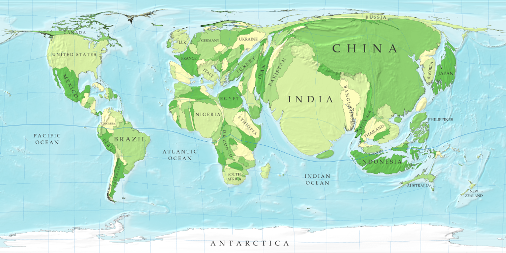
http://www-personal.umich.edu/~mejn/cartograms/population1024x512.png

This is a cartogram of the world's relative population. The map is distorted to show the size of the population in each country. According to this map, China and India seem to have the largest population.

Flow map

https://blogger.googleusercontent.com/img/b/R29vZ2xl/AVvXsEirw142BTcMnlfALJcA6MCBPOVKF7GIUVZ9LkkBiDRDmp2R0qZzMUWz_wryxsCXm6Abx8uPbYmpD2VZufZZ-oZhOlqQ6PsmNITIZHvW8gqAvQYJBETfLl-tgUOhjgrOQJ5SYbqhQE66aPiV/s1600/migration-flow-map-august-2008.jpg

Flow maps are used to show movement of objects from one place to another such as the movement of people out of or into a country. This is a flow map of the labor migration in the Greater Mekong Subregion.