Map Catalog
Sunday, February 12, 2012
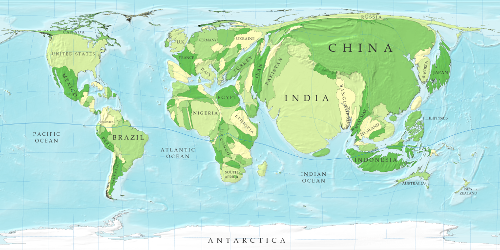
Cartogram
http://www-personal.umich.edu/~mejn/cartograms/population1024x512.png
This is a cartogram of the world's relative population. The map is distorted to show the size of the population in each country. According to this map, China and India seem to have the largest population.
No comments:
Post a Comment
Newer Post
Older Post
Home
Subscribe to:
Post Comments (Atom)
No comments:
Post a Comment