http://designrevival24.files.wordpress.com/2011/06/mental-map-from-6th-grade-f.jpg
This is mental map from a 6th grader. It seems he's mapped out what he remembers of some streets near an elementary school. Mental maps are just that: maps created by one's memories. One person's mental map will most likely never be the same of another persons'. People's perceptions of certain areas will always be different.
Map Catalog
Tuesday, April 3, 2012
Star plots
http://2.bp.blogspot.com/_f1pDtZIbJo8/TPav8VacBII/AAAAAAAAAII/y4O5Nu7vIOk/s1600/starplot.gif
Star plots are used to show multivariate data for one topic. This star plot shows different aspects to a car and places values on each one according to where it's located on the plot. According to the plot, "cylinders" at the end of the radius represents the cylinders of the most powerful car. The blue block (the star plot) then shows us where the car we are looking at falls along that radius. This is useful to people because they can look at one product and compare how it rates to the best product on the market.
Star plots are used to show multivariate data for one topic. This star plot shows different aspects to a car and places values on each one according to where it's located on the plot. According to the plot, "cylinders" at the end of the radius represents the cylinders of the most powerful car. The blue block (the star plot) then shows us where the car we are looking at falls along that radius. This is useful to people because they can look at one product and compare how it rates to the best product on the market.
Correlation matrix
http://yin.che.wisc.edu/images/ProteinMatrix.jpg
Correlation matrices show correspondence between all pairs of data. This above matrix shows the correlation between proteins. Correlated behavior is shown by colors. Red shows high correlation while blue shows low correlation.
Correlation matrices show correspondence between all pairs of data. This above matrix shows the correlation between proteins. Correlated behavior is shown by colors. Red shows high correlation while blue shows low correlation.
Similarity matrix
https://blogger.googleusercontent.com/img/b/R29vZ2xl/AVvXsEiqWAwJ9fO3qF3JOv_4PsdF1cbYAICKOu_o6KNbYqiw4b8p-F74a70OvE40h68IwRprNJ8G-_UQxm5_4PDXxFoYHNCcbZz_EowVeO3qFMpA_0BcJMX7lhFOYF1J55JTMXF9WvaQzJ3lu4Rm/s1600/similarity.jpg
Similarity matrices are made to show similarities between two data points. The higher the score, the more similar the characters. Low scores correlate with dissimilar points. Linear transformation under two different bases such as the one above, represents matrices that are very much alike.
Similarity matrices are made to show similarities between two data points. The higher the score, the more similar the characters. Low scores correlate with dissimilar points. Linear transformation under two different bases such as the one above, represents matrices that are very much alike.
Stem and leaf plot
http://mainland.cctt.org/mathsummer/josephbond/stemandplots/images/table2.gif
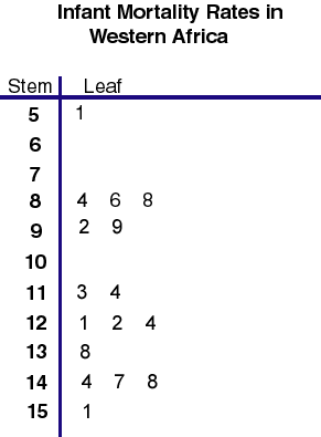
Stem and leaf plots are great for presenting qualitative data in a way that is easy to visualize and understand, a lot like a histogram. This stem and leaf shows infant mortality rates per 1,000 live births in Western Africa.
Stem and leaf plots are great for presenting qualitative data in a way that is easy to visualize and understand, a lot like a histogram. This stem and leaf shows infant mortality rates per 1,000 live births in Western Africa.
Box plot
http://www.stat.yale.edu/Courses/1997-98/101/boxplot.gif
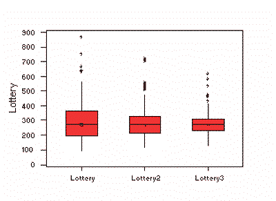
Boxplots are made to summarize data that is measured in intervals. This box plot shows winning numbers in a lottery three different times. The median for each set is shown by the black line in the red boxes. In this plot, the medians are all nearly the same.
Boxplots are made to summarize data that is measured in intervals. This box plot shows winning numbers in a lottery three different times. The median for each set is shown by the black line in the red boxes. In this plot, the medians are all nearly the same.
Histogram
http://upload.wikimedia.org/wikipedia/commons/thumb/c/c3/Histogram_of_arrivals_per_minute.svg/250px-Histogram_of_arrivals_per_minute.svg.png
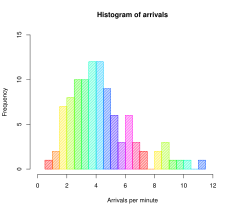
Histograms are designed to show distribution of data in a way that makes it easy for people to compare visually. This histogram shows the frequency and arrivals per minute. For example at 6 arrivals per minute there was a frequency of about a 6 or 7.
Histograms are designed to show distribution of data in a way that makes it easy for people to compare visually. This histogram shows the frequency and arrivals per minute. For example at 6 arrivals per minute there was a frequency of about a 6 or 7.
Subscribe to:
Comments (Atom)


