http://mainland.cctt.org/mathsummer/josephbond/stemandplots/images/table2.gif
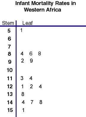
Stem and leaf plots are great for presenting qualitative data in a way that is easy to visualize and understand, a lot like a histogram. This stem and leaf shows infant mortality rates per 1,000 live births in Western Africa.

No comments:
Post a Comment