Tuesday, April 3, 2012

Mental Map

http://designrevival24.files.wordpress.com/2011/06/mental-map-from-6th-grade-f.jpg

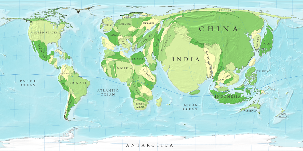
This is mental map from a 6th grader. It seems he's mapped out what he remembers of some streets near an elementary school. Mental maps are just that: maps created by one's memories. One person's mental map will most likely never be the same of another persons'. People's perceptions of certain areas will always be different.

Star plots

http://2.bp.blogspot.com/_f1pDtZIbJo8/TPav8VacBII/AAAAAAAAAII/y4O5Nu7vIOk/s1600/starplot.gif

Star plots are used to show multivariate data for one topic. This star plot shows different aspects to a car and places values on each one according to where it's located on the plot. According to the plot, "cylinders" at the end of the radius represents the cylinders of the most powerful car. The blue block (the star plot) then shows us where the car we are looking at falls along that radius. This is useful to people because they can look at one product and compare how it rates to the best product on the market.

Correlation matrix

http://yin.che.wisc.edu/images/ProteinMatrix.jpg

Correlation matrices show correspondence between all pairs of data. This above matrix shows the correlation between proteins. Correlated behavior is shown by colors. Red shows high correlation while blue shows low correlation.

Similarity matrix

https://blogger.googleusercontent.com/img/b/R29vZ2xl/AVvXsEiqWAwJ9fO3qF3JOv_4PsdF1cbYAICKOu_o6KNbYqiw4b8p-F74a70OvE40h68IwRprNJ8G-_UQxm5_4PDXxFoYHNCcbZz_EowVeO3qFMpA_0BcJMX7lhFOYF1J55JTMXF9WvaQzJ3lu4Rm/s1600/similarity.jpg

Similarity matrices are made to show similarities between two data points. The higher the score, the more similar the characters. Low scores correlate with dissimilar points. Linear transformation under two different bases such as the one above, represents matrices that are very much alike.

Stem and leaf plot

http://mainland.cctt.org/mathsummer/josephbond/stemandplots/images/table2.gif

Stem and leaf plots are great for presenting qualitative data in a way that is easy to visualize and understand, a lot like a histogram. This stem and leaf shows infant mortality rates per 1,000 live births in Western Africa.

Box plot

http://www.stat.yale.edu/Courses/1997-98/101/boxplot.gif

Boxplots are made to summarize data that is measured in intervals. This box plot shows winning numbers in a lottery three different times. The median for each set is shown by the black line in the red boxes. In this plot, the medians are all nearly the same.

Histogram

http://upload.wikimedia.org/wikipedia/commons/thumb/c/c3/Histogram_of_arrivals_per_minute.svg/250px-Histogram_of_arrivals_per_minute.svg.png

Histograms are designed to show distribution of data in a way that makes it easy for people to compare visually. This histogram shows the frequency and arrivals per minute. For example at 6 arrivals per minute there was a frequency of about a 6 or 7.

Sunday, April 1, 2012

Triangular plot

https://blogger.googleusercontent.com/img/b/R29vZ2xl/AVvXsEjeDc5yvRVXSl3XLUgxRXqRKqNZKMneG9AhfPOKQsL6qWGGufKkmBrOxcztmBw7QDwTx_ChfdhBlOca4QjRpeW5D5V8W2LztRE8bUpDzoYeFmVwQzzemdg2IsPjT-QynyajR8EC3kNj41i4/s400/triangular+plot.png

A triangular plot displays three variables presented in a triangle so it is easy to compare the data. This plot shows the percentage of conservative, liberal, and labour votes.

Windrose


http://www.mathworks.com/matlabcentral/fx_files/17748/5/wind_rose.png

Windroses are on maps to show how wind speed and direction are distributed at a particular location. This  windrose shows that there is a higher wind speed towards the west.

Climograph

https://blogger.googleusercontent.com/img/b/R29vZ2xl/AVvXsEjOoIPJHn2dVXKhTnySrjMIXtqNqyyyHmk-2E5wkrZMXkW-WBss4o3GfqBV4RTTWIm1m77eaErIRLf3iueAdIeXKPWvmqq1DZuCaO5cBkrifhEKPASIyKaeHhfE4r34lBkAPnxh4wbYf1U/s1600/44.gif

Climographs graphically depict monthly precipitation and temperature. This is a graph charts the monthly precipitation and temperature for Moscow, Russia.

Population profile

http://2.bp.blogspot.com/_46URaoUSp0A/S83Yp5Ojf7I/AAAAAAAAAD8/hzPSigx8cKc/s1600/image.jpeg.gif

Population profile maps are designed to show demographic grouping. This map shows ages of males and females in the United States.


Scatterplot

http://upload.wikimedia.org/wikipedia/commons/thumb/0/0f/Oldfaithful3.png/240px-Oldfaithful3.png

Scatterplots display values for a set of two variables for a set of data. This is a scatterplot of two Old Faithful eruptions. It shows how many minutes are in between the two eruptions and the eruption duration.

Index value plot

https://blogger.googleusercontent.com/img/b/R29vZ2xl/AVvXsEjjUrPXvSFNR0U2JpDNXz28SwVfvY-I8bY6pabce-coJd0HgMMQ93k0SPaikLHyksHU9aoLW8WgzEsVSC4TFss1uQw8rrwGMqW-vIcTOGUMSIgnZG78iwhOd7orUqh7WweYjzLBZlp2FXU_/s320/Index+Value+Plot.gif

Index value plots are designed to indicate absolute numbers and values. This map shows the expected percentage of average streamflow index in North Carolina from 1999 to 2008.

Sunday, March 25, 2012

Accumulative line graph or Lorenz curve

https://blogger.googleusercontent.com/img/b/R29vZ2xl/AVvXsEi4JV7DGwVyeHADGQ9nnUzZ37_Sp1X99dDqDkQ_3AMxRJ1caUbFSaEU7kvvLoaBma_P88ndETMOUHVkFWwVidbiBV2UFjC0iNl-GjwL9JQRJDwCpjd5f9WWxHA-MNejqLq7DbW898aG7FO1/s1600/Lorenz_curve.jpg

This type of graph is a geovisualization of household income and expenditure. The center line is the line of equality.

Bilateral graph

https://blogger.googleusercontent.com/img/b/R29vZ2xl/AVvXsEia3xUBrPmi0u5op0JdWh_MI6cnwwwHbX-7GgqA7tIHYdZpjmtgQHcYwRpX-H3jRWUZR4KBU-amAJwH2M0CKry3xuxEM1p6t9cxt3s6gkEVhtDjEmVQqjkNYcrdLASAs3o3VIWeuPCQ-xPt/s1600/bilateral-graph-02-lg.gif

This bilateral graph shows the percent correct for three month intervals. The increases and decreases are shown for each amount for 3 months.

Unstandardized choropleth maps

http://eps.mq.edu.au/courses/GEOS219/images/deaths.jpg

Different color shades are used in unstandardized chloropleth maps to represent data. These types of maps are not aerially averaged, nor do they use numerical data or ratios. This map shows deaths per 1,000 live births in Australia.

Nominal area choropleth map

https://blogger.googleusercontent.com/img/b/R29vZ2xl/AVvXsEiXdtpUXqJ43TRH41yZJJ7dNFGf7w8Ml3J-km9tAp42fRorn8nrs1Zgo0ZE7qrxDNZYXwqLZtEAtTZB9HnQrZVTPr739-JYFdimY0LDEtVp8e063S6dytMmc0PIz7uK6Byr0R72sYwlQKY/s1600/Figure+8_3b.jpg

This map shows quantitative differences in the access to safe drinking water. Nominal area chloropleth maps use nominal data to represent information.

Standardized choropleth maps

https://blogger.googleusercontent.com/img/b/R29vZ2xl/AVvXsEhleNWA8guoD-ne-iqQU6kBBM6tu47rwnGWW-5LdETOHg-RUmvnqanzbipp6gxZiPoAjgKvARseRFuAQkd1hODb_tEKHYPU1Tmz4vLb46yqt7A-PESIVFzmLlGN38LMBmQz1YSWKvOi2c4/s1600/standardized+c+map.PNG

Standardized chloropleth maps calculates the population per square mile so that the distribution of people can be compared. The shading shows the relative population distribution in each state.

Univariate choropleth maps


https://blogger.googleusercontent.com/img/b/R29vZ2xl/AVvXsEhxDcmAV76l64QA8kcjmt_KtF5GTmNMFRoU5-KPnty4G5ozkEy9tktREJUOf3Wz3HUw7qW7RrONwBAz8hUEv2ZCxmR_CEFtGWVt_aEUSQpAdcOaiooUjIMoFhigUnVWD3At9bqwDOrt5Ec/s1600/Choropleth.gif

A univariate chloropleth map shows a single data set. This map shows water use in the U.S. by shading the states with different colors. The darker the color, the more water use, so Texas, Florida, and California are shown to use the most water.

Bivariate choropleth maps

http://www.mpassociates.gr/software/distrib/science/golden/PrismMap.gif

This bivariate choropleth map shows the distance from the Mississippi River as well as number of confirmed human cases of the West Nile Virus. Distance is shown by color and number of cases is shown by the height of each state.

Unclassed choropleth maps

http://www.agocg.ac.uk/reports/visual/casestud/dykes/figure9.gif

The shadings are proportional to the data values in unclassed chloropleth maps. Because of this, the data does not need to be classified.

Classed choropleth maps

https://blogger.googleusercontent.com/img/b/R29vZ2xl/AVvXsEj7r8h3t7sxbyVM4xmTwiId1z1Tcup2uRSKGej3qtaAeG4QvwgE04olvailtOMRlayYVp20aPQ_xhY6NcVIoJIYigo1QhftyCSahq6hPlijQMYlQ0LRjXAjgHD55AN6LTzO0E2HPbM7z3Q/s1600/beefmethaneJMK.gif

This classes chloropleth map uses coloring and shading to depict the beef cattle emissions in North Carolina. The darker the area, the more emissions being produced.

Range graded proportional circle map


http://www.neiu.edu/~jrthomas/377/circle.jpg

This range graded proportional circle map shows the proportion of Mexican people in each state. The circles are in different sizes proportional to the given value of the data. Texas and California have the biggest circles, therefore there are more Mexicans living there than any other states.

Continuously variable proportional circle map

https://blogger.googleusercontent.com/img/b/R29vZ2xl/AVvXsEjHFzLQP6r39_lF7gWQfAVuk6lyPXSxA7UOYBu8OlYeRokFlfT9C-eyEo1h53hjTxq03IMOYWA_vO9ogHYH33Ofpsnvg23RKt3AGfGtpauzXT96V3Wg_vN8yrnYDii6AZebp5UIRnBA39c/s1600/continuosly+variable+proportional+circle+map.jpg

Continuously variable proportional circle maps depict the proportion of a variable in a certain area. The one above shows the proportion of Hispanics in California's cities in relation to each other.

Sunday, February 26, 2012

DRG

http://128.206.12.101/data/drg/images/drg-index-map.jpg

This is a DRG map of Missouri.

Isopleth


This isopleth map shows hydrogen ion concentration made at field laboratories. On the west, the ph is high and on the eastern side, the ph is low. https://blogger.googleusercontent.com/img/b/R29vZ2xl/AVvXsEjV66nVhTm_xmykJ-VS05J7x0ftHoxiAqHZOQ3EsB4-sWUROdksdhu7HoImnUxPce10odleNmdX4Kfdj3eNTUrY8fqTYsc7dz50S0WRuNjs5gKp4oZfRvsVk4YjFP6J1OpealzMs1vTCpN5/s1600/isopleths.png

Isopach


https://blogger.googleusercontent.com/img/b/R29vZ2xl/AVvXsEgHMu2bQAiiwE38dhlepWOZ3VLOKuwPG4zhNFokoXoNf2jjrAENhNMA6dRszaouIf7JiFWPFTU7PJjGzCCQVaQ3m7B0iDPVVruiBoX-vHV8MK2Ui-x9p79ur5fCqPYnDrux-tsVJ5VEurY/s400/Isopach.jpg

This is an isopach map displays a small gas field showing how the type of ground and how thick it is. Raw material is obtained by going through the ground so it is important to know how thick it is. 

Isohyets

https://blogger.googleusercontent.com/img/b/R29vZ2xl/AVvXsEhCvZr3Z8om7lgaUDVZDZl-5D5ba_euqpeLR_lIYMlBRQeT_uvE4V4lI8ZXBy4hO0kSApVllkl1uCadS_Uk8plzxoqMV-u4E6sDhcyWntUu3Gs-nHCurI2JDmpdXdALMSPhyphenhyphenA2YMMKBV0n1/s400/isohyets.bmp

This map shows areas of equal rainfall by its contour lines. Therefore it is an Isohyet map.

Isotach

http://www.erh.noaa.gov/btv/events/28Oct2008/300mb_isotachs_28_18z.gif

This is a map showing wind blowing across the U.S. towards New York/New England area. It is an isotach because the lines are connecting points with equal wind speed.

Isobars

http://www.newmediastudio.org/DataDiscovery/Hurr_ED_Center/Hurr_Structure_Energetics/Closed_Isobars/Closed_Isobars_fig02.jpg

This is a map showing closed isobars around a low pressure cell. This means that the air is rising and there is likely to be clouds, rain, and strong winds.

LIDAR

http://www.noaanews.noaa.gov/stories/images/manhattan-lidar092701.jpg

This is a Light Detection And Ranging image of lower Manhattan. You can see the different elevations of the buildings. 

Doppler Radar

http://www.ssd.noaa.gov/goes/east/carb/rb-l.jpg

This is a doppler radar image of the Florida-Bahamas ocean area. It shows general motions of precipitation.

DEM

http://www.webpages.uidaho.edu/~simkat/geol345_files/lunar_DEM.jpg

This is a digital elevation model of the moon. It shows a 3D representation of the moon's surface. You can see craters on the moon depicted by different colors.

Sunday, February 12, 2012

Black & white aerial photo

http://www.expertgps.com/images/aerial-photo-boston.jpg

This is a black and white aerial photo of an airplane runway in Boston.

Infrared aerial photo

https://blogger.googleusercontent.com/img/b/R29vZ2xl/AVvXsEg3XqXA0FPg4MgCwXGJ6Zkyb-evtLtcqON2ZYIvMSVVrqJpywc0u4V7nNPf__3cJ0NeOL1JXgpabqUCSr9iubpcnUqYI_vP-zl-5tcCWJjbSXbDJIFFD7-vshR71jThwLjzIoJ-czz5xEdp/s1600/aerial+infrared.jpg

This is an infared aerial photo of a forest in Fort Leavenworth, Kansas. The picture is an example of an infared aerial photo in which color is used.

Cartographic Animation

https://blogger.googleusercontent.com/img/b/R29vZ2xl/AVvXsEh-u85WpOUgMdGe7rkje_Wbf6mf1z6dwxNo1EzC9rC0-JFZhYG_eOGqOjIJrYUgX7KaeFiUo_NXM88usO28-6diDXsOdGwodbEnFz6o_i0ZVqScGfaMqszr_8SPVq3ROyuzAn3a_5-s0-4/s1600/Cartographic+Animation+Maps.png

Cartographic animations have evolved with the use of technology. They are used to demonstrate a temporal change. This is a cartographic animation of Hurricane Katrina and how it was moving towards the U.S.

Statistical Map

http://4.bp.blogspot.com/_b_Fy-HKi1ks/STaZV9Z8iQI/AAAAAAAAAD4/P7diA-HOy2o/s320/obama_vs_mccain.gif

This is a Statistical Map of the Obama vs. McCain 2008 election. It represents each state as being either statistically democratic, republican, or undecided by using colors and a numbered scale.

Cartogram

http://www-personal.umich.edu/~mejn/cartograms/population1024x512.png

This is a cartogram of the world's relative population. The map is distorted to show the size of the population in each country. According to this map, China and India seem to have the largest population.

Flow map

https://blogger.googleusercontent.com/img/b/R29vZ2xl/AVvXsEirw142BTcMnlfALJcA6MCBPOVKF7GIUVZ9LkkBiDRDmp2R0qZzMUWz_wryxsCXm6Abx8uPbYmpD2VZufZZ-oZhOlqQ6PsmNITIZHvW8gqAvQYJBETfLl-tgUOhjgrOQJ5SYbqhQE66aPiV/s1600/migration-flow-map-august-2008.jpg

Flow maps are used to show movement of objects from one place to another such as the movement of people out of or into a country. This is a flow map of the labor migration in the Greater Mekong Subregion.

Tuesday, January 31, 2012

Isoline map

http://www.learner.org/jnorth/images/graphics/u-z/weather_isotherm032401.gif

This is an isoline map of the U.S. displaying the average temperature from March 18 to 24, 2001. The scale of temperature indicated by colors ranges from 100 to -30 degrees Fahrenheit. The lines indicate the general boundaries of the temperatures. As you can see on this map, the temperatures at this time ranged from the 80's to the 30's.

Proportional Circle Map

https://blogger.googleusercontent.com/img/b/R29vZ2xl/AVvXsEga0ydm4Fg9E18EfVLLzpZWFf7QHnV2Sn02oMPif8jI7BpoqlJzkbvaK-F21I6Y1jnJ0Pr7pNWk4Y16sGkYSAk6OEG_lSWGlhBDTjG1S3f7DN9RvDJIOUUUQtI3Y1r630-2-GvdZJmoK600/s1600/Range%252BGraded%252BProportional%252BCircle%252BMap.gif

This is a proportional map showing the Hispanic population in the U.S. by using circles in each state indicating the population in 10,000, 100,000, and 10,000,000. According to the map, it seems Texas and California have the largest Hispanic populations.

Choropleth maps

https://blogger.googleusercontent.com/img/b/R29vZ2xl/AVvXsEivK6GcQ69pSWKmZN63Mx3VLfDSEtmMkKjjnhDPC-CcHUH384TGLLPpXw9wSXo_Nv1EnRBjzaCvXiiphBjY8EvdHVaJ-sBGGS_eWSxKqaUFijhVhd6UhwZ3RidEk0UkCjhNHyPVBg9xEOUj/s1600/changeanim.gif

This is a choropleth map showing the change in divorce rates between 1980 and 1990. It does this by having a scale of different colors showing the percent increase of divorce rate in each state.

Dot Distribution Map

http://www.census.gov/geo/www/mapGallery/images/small2kden.jpg

This is a dot distribution map of the United States. The white dots represent the population distribution in the year 2000. According to the map, it seems that the majority of people reside on the east and west coasts.

Propaganda map

https://blogger.googleusercontent.com/img/b/R29vZ2xl/AVvXsEil5JfdwqSGqnuN9czBSPyuk_BdheoX-ud5bjxvXFaBew-udzwgo_oI8HI4eWE-jvPllb-hgDD-QopDvOWwy6x-Z5YqtciAQ6_8jtx2yb1s1agjNIbjN3jWqcHUkJyqEwu2iA2F6_NEL-4/s400/map-of-florida.jpg

This is a propaganda map of Florida. It is clearly used to persuade people to come vacation at Florida by displaying an attractive female relaxed on the sand. It emphasizes the coast of Florida by showing much of the Gulf of Mexico and arranging pictures of palm trees and tourist attractions on the state.

Hypsometric map

http://www.reliefshading.com/colors/pictures/hypso_france.jpg

This is a Hypsometric map of France. It shows elevations of the land by contouring and shading.

PLSS maps

http://upload.wikimedia.org/wikipedia/commons/8/83/Meridians-baselines.png

This is a PLSS map of the United States. This map shows the principal meridians and baselines in order to survey the states.

Monday, January 23, 2012

Thematic map

http://www.gigawiz.com/images9/thematic1.jpg

This is a thematic map of the United States. It displays the states' party control of governor's offices as of 2007 in each state by showing them either in blue or red to show that it's democratic or republican respectively.